Wednesday, 24 November 2010

Connotations in Tabloid Journalism.


After an introduction to Semiotics, we went on to analyse particular stories from tabloid paper, and I chose the story...

"PUNISHING THE POOR"

> Fury as massive council rent rises
>ConDem plans 'attack the vulnerable'

From Daily Mail's 23.11.10 publication.


From the very beginning, from the three word title "punish the poor" it is clear to see which social stance the paper is taking on this issue- having empathy with the "hard-up families", and the Government Ministers clearly being depicted as "the enemy" in a quote from Defend Council Housing campaign group, "ministers must rethink this madness".


The signifier in this article is:

*The written/spoken/imagery- analysis.
*The image of the Minister, Grant Shapps, looking confident, bold, finger-pointing, perhaps somewhat aggresively.
*Concil housing- dirty, unkept examples of ill living- emphasising the "lower class vulnerability" of the persons whom may experience the forthcoming rise in council housing rent payments.


The signified in this article is:
*The summary of the article- anger and frustration as Government plan to raise the cost of counil house living, attacking those most economically vulnerable.


The denotation (what is being denoted) in this article is
*People's basic understanding of Goverment and Council Housing-
*The contrast between the two social groups- the lower classes "vs" the upper classes- the most powerful placing the poor in even greater stages of economic vulnerability.


The connotation (what is being connoted) in this article is:
*The associational meanings of Government and council housing, what the public potentially percieve (notes here specific to the article):
*Corrupt
*Powerful
*Manipulative
*Vulnerability
*Lower-Classes
*Lieing
*"Savage"
*Hardship
*Struggles

The myth in this article is:
*The system and rise in council house costs will affect as many people, if not more so, in a negative way that the positive aspects the exsisting council housing scheme has to offer- the negatives will outweight the positives.
*The current coalition Government is corrupt and manipulative "heads they win, tails you loose with this Governement".

An Introduction to Semiotics.


Aims:

*Understand the basics of semiotic theory.
*Have an idea of how to apply semiotic theory.
*Understand the following terms- code, sign, signifier, signified, arbitary, denotation, connotation, myth.
*Understand the importance of 'meaning' in the study of art, design, and culture.

What is semiotics?

*The "science" of studying signs- a social science which emerges from linguistics (anything that can give meaning in society).

Meaning of semiotics and linguistics were developed by Ferdinand de Sanssure (Swiss Linguist).

Linguistics is the science which explains how language works- the "agreed" meaning of words, formed by society.


In the same way we can unravel meaning in language by understanding the written and spoken material, we can also unravel meaning in cultural as operating like a language.

a code=a system of symbols or signs.

*Culture operates like a system. Semiotics is understanding how meaning is structured. All meaning is constructed through codes- symbols and signs which collectively form a meaning.


One example we evaluated to distinguish systems of meaning was looking at different ways in which a suit can be worn, with three examples: "ghetto/ganster" culture, "punk rock" culture, and the stereotypical image of a business man in a suit. This system of meaning (suit) is referred to as a "text" in linguistic- even if we are talking about an image, it is referred to as "text" due to the fact that we read them (deeper meaning and analysis).

The text is created from various riffs within an agreed cult or social culture- conformists/uncornformists, etc- belonging to a particular group, developed to a system that everyone comes to know and understand, a "code".


Films such as Blazzin' Saddles and Star Wars challenge semiotics, whereupon the debunk the nature of cultural codes and why they mean what they do. Along with many other paradoies of the Western genre, Blazzin' Saddles has a central character of an Afro-Carribean cowboy (which, as history has shown us, this would never of happened in this social culture), whereas Star Wars plays up to te conventions of outer space.


*Codes are found in all forms of cultural practice.
*In order to make sense of cultural artefacts we need to learn and understand their codes.
*We need to acknowledge that codes rely on a shared knowledge.


As aforementioned, the theory of semiotics was developed by Swiss linguist, Ferdinand de Saussure, who tried to show the unlogical relationship between words and their signified meaning.

For an example, we looked at an image of a dog- the name 'dog', although having no particular link with the animal itself has had a concentual agreement to be named this particular name, whereas 'woofer!' or 'barker!' would, of course, be more appropraite, in it's sound/image signifier form.


THERE IS NO LOGICAL RELATIONSHIP BETWEEN THE SIGNIFIER AND THE SIGNIFIED IN LANGUAGE.
THIS RELATIONSHIP IS ARBITRARY.
How is a sign made-up?
A sign has two parts:
signifier + signified= sign
A signifier is:
*Written word e.g 'dog'
*Spoken word 'dog'
*Barking by a dog
*Picture of a dog
Signified is:
*Mental concept of a dog
Signifier= Sound Image
Signified= Mental Concept
Rolan Barthes wrote 'Mythologies' in 1957- an analitical study of meaning within society. Barthes was a critical and theoretical essayist, writing deeply about aspects of French culture and what they mean within society.
Breaking down signifers and signified analysis further, meaning can be broken down into "denotation" and "connotation".
Denotation: Basic understanding og a dog 'four legged creature' etc.
(what is 'denoted')
Connotation: associational meanings of a dog- 'loyalty', 'companionship', 'Krufts', 'walks', 'smells'.
Connotations are culturally specific and taught by society- with a deeper meaning embedded within our subconcious- associations that we always make, not a concious thought or decision.
We studied an image- an advertisement for Scotch Whiskey with a couple sitting on a luxurious sofa amongst the open wilderness of a Scottish Glen, with the title above reading
"Take yourself to the Glen of tranquility"
We searched for what the image connoted, and I came up with these particular points:
*advertisement for whiskey connoting relaxation, "the wild outdoors", peace, "breathtaking wilderness", Scotland (the heartland of whiskey), a shared experience, calming, fresh, a social element: "drinking this whiskey will take you to Scotland". The Corbusier sofa gives an air of sophistication in it's Modernist design, a stylishness in the mixture of traditionality and modern sophistication*
Barthers said that MYTH comes into play in the realms of connotation, and became problamatic for him- he saw it that many didn't understand that they are socially given connotation in their idealogies.
'The Myths which suffuse our lives are insidious precisely because they appear so moral"- Barthes, R.
We then went on to analyse John Constable's 1821 painting, 'The Haywain', which, through time has come to connote the myth of quintessential Englishnes- green, pleasant, pastural land with big, rolling hills. Images such as this have a large part to play in this idealology that many still maintain to this day, nearly two hundred years on.
The image was infact painted at a time of mass rioting, and this would have been painted for the wealthy land-owner to compliment their fantasies and rose-tinted view of the country.
However, as I have previously mentioned, this connotation has now become "the norm" of Britons, and people the world over today.
This goes hand-in-hand with people's views and the connoted view of England as a prosperous and victorious country- stemmed from the myth of St. George (the Country's Patron Saint), whose courageous slaying of the ruthless dragon resulted in a Pagan country converting to Christianity- even portayed today in popular culture, football matches etc- sense of pride and symbolism.

We looked at various other images and how they can be connoted- what symbolism the images intended to represent- ranging from the Eva Hertzegonia 'Double Major' Wonderbra advert (famously causing road traffic accidents as men couldn't take their eyes from the advertising billboard!) sexualising and dumbing-down the image of modern woman to appeal to the majority of men, to the racial sterotypes of 'wicked won' chinese restaurant's "no! we no see cat of yours. no more ask please." advertisment. This, perhaps both contreversial, and yet humuorous advert works as a tool to attract people to their restaurant, promoting their "Chinese-ness", yet also potentially offensive- contreversey sells!

Sunday, 21 November 2010

'The Document'.


"Still there is something predatory in the act of taking a picture. To photograph people is to violate them, by seeing them as they see themselves, by having knowledge of them as they can never be; it turns people into objects that can be symbolically possessed. Just as the camera is a sublimation of the gun, to photograph someone is a subliminated murder- a soft murder, appropraite to a sad, frightened time."- Susan Sontag, 1979:15.

*** The document describes the photograph as an objective and truthful document of the world, photography as a fact. There are always hidden power struggles in photography- with power, agenda and neutral imagery. ***

Aims:
  • To introduce documentary photography and conflict photography.
  • Introduce the work of Mass Observation, Magnum and the FSA photographers.
  • Explore questions of objectivity and subjectivity inherent in documentary practice.
  • Interrogate the authoritity of the photographic image.

James Natchwey, famous War Photographer states

"I have been a witness, and these pictures are my testimony. The events I have recorded should not be forgotten, and must never be repeated."

  • Documentary photography is evidence not to question- in a neutral state.
  • Using the camera to investigate social change, recording for history in it's documentation (and to inform others) "a camera with a conscience"- not purely there to visually record, but also to expose threat, scandal, etc.
  • James Nachtwey (http://www.jamesnachtwey.com/) shows visual documentation with the idea that ending conflict inspires him to create a sense of humanity. A powerful antidote to the end of War, whereupon photographers emerse themselves in these potentially life-threatening situations to emote and inform the masses- protesting to make other protest. The documentary photographer's role is to be involved in societies- often taking a stance and taking political sides with hopes to communicate and persuade.

Palestine, 2000, James Nachtwey.

Rwanda, 1994, James Natchwey.

Sudan, 1993, James Natchwey.

Frances Firth (1875) "Entrance to the Great Temple"- the beginnings of photographic practice show documentation of the divides between "us" and "them"- and introduces people to new cultures and societies that they may have otherwise never seen, creating bonds, yet also driving classes and socities further apart than ever.


William Edward Kilburn, 'The Great Charitist Meeting At the Common' (1848)- the photographer here removes himself from the crowd, detached from the image- creating a sense of authenticity, though this is not neccessarily as emotive or thought-provoking, as it depeicts an outsider looking on, not in.


"The Decisive moment"

Roger Fenton (1855) 'Into the Shadow of the Valley of Death'.

"Photography achieves it's highest distinction- reflecting the universality of the human condition in a never-to-be-retrieved fraction of a second."
-Cartier-Bresson

Henri Cartier-Bresson
Gare Saint Lazare, 1932 Paris, Place de l'Europe.

Cartier-Bressons images were distinctive for being very composed in his ideas, he would reportedly wait for hours for "the decisive moment"- by capturing a fraction of a second, creating something more artistic than standard objective photography.

But in documentation, such as Cartier-Bresson's is there an element of aestheticisation? And if so, does this make it truly documentary?


Jacob Riis (1888) 'Bandits Roost'- a middle-class campaigning photographer, photographed scenes of poverty and squalor to show the public, in order to prompt reforms to ease these people out of poverty and lower-class living.


Of course, these pictures, with the technological advances of cameras in these times wouldn't have been a "quick snap", but carefully set-up and posed- these men were far too respectably dressed to have been from the lower classes, and with the hinsight on modern day, this picture cannot show a true depiction of the time- yet with this documentation the only thing to relate to, this is all people have to distinguish societies and cultures of these times.
This was socialisation as much as documentation. Vouyeristic, "allowing" the rich to spy on the poor, was this a hidden agenda for Riis as he published his photographic works, was it purely a money-maker?


Lewis Hine, Russian steel workers, Homestead, pa. 1908

This photographed showed neutrality with humanity. Sharing the plight og immagrant workers as normal, strong and hard-working people.


FSA Photographers (1935-44.)- Farm Security Administration (Department of Agriculture)

  • Director: Ray Stryker
  • Depression: 11 million unemployed
  • Mass migration of farm-workers and labourers 'Oakies'
  • They used photography in photojournalism and as an effective emotive lobbying tool
The "Shooting Scripts" instructed as to lobby: which pictures to take, etc- with complete agenda.

Margaret Bourke-White, 'Sharecroppers Home', 1937.

The staged scene is created to be very emotive to the audience- with the youth and innocence of the young boy and faithful dog by his side, the newspaper-lined walls reflecting commercialism and industry- affluent vs. impoverished- not at all neutral, staged, emotive and biased.

Russel Lee, 1939, 'Interior of a Black Farmer's House'.

Dorothea Lange, 1936, 'Migrant Mother'- THE image of the depression.

The FSA were service members, as oppossed to artistic creatives, they were employed by the Government, and were expected to send them their negatives, whereupon the choice photos would be selected- with the photographers getting no real say in the images chosen- and the results and images chosen would often be far different from their personal choice.


Mass Observation 1937-1960's
  • Tom Harrison (anthropologist)
  • Charles Madge (poet)
  • Humphrey Jennings (filmmaker)
  • Humphrey Spender (photographer)
1/2 political, 1/2 social. The Mass Observationists in Photography tried to depict every day life in Britain.
  • Leica cameras were invented circa 1920- easily to document and photograph, instant results- really capturing a moment.
  • Photographer's roles become far more socially important, yet could only have been completed thanks to the new, modern technologies.
War/Conflict


Robert Capa, Normandy, France- 1945, documenting yet also aesthetisised? The distinctive "Capa shudder" led people to believe that he tried to "glamourise" drama and devistation.


The Magnum Group

  • Founded in 1947 by Cartier-Bresson and Robert Capa.
  • Ethos of documenting the world and it's social problems.
  • Promoting Internationalism and mobility./
In conclusion, the Magnum Group was a collaborative network of journalists and photographers of whom inspired to "record the world for humanity".

Robert Capa.


Don Mucillin 'Shell Shocked Soldier'.

Robert Haeberle (1969)- The Milie Massacre- Vietnam, whereupon innocent civillians were slaughtered (such as the family in this photograph). The family in this image were seconds away from being shot, when Haeberle intervened and called for the American soldiers to stop- though not to stop shooting them, but to pause for a second so that he could take a photograph, thus he captured them in their last moment of these people's lives- a moment of true horror.

For a group and movement which was said to have been established for the sake of humanity and spreading awareness, how humane was this? Surely, he could have tried to save these people?
Summary of Documentary Photography:
-Offering a humanitarian perspective.
-Portraying social and political situations.
-Objective is to tell the facts of the situation.
-People usually form the subject matter- emotive and human.
FURTHER READING:
  • Barthes, R (1982) 'Camera Lucida', UK, Hill & Wang
  • Clarke, G (1997) 'The Photograph', UK, Oxford University Press
  • Edwards, S (2006) 'Photography: a very short introduction'
  • Sontag, S (1979) 'On Photography', UK, Penguin
  • Wells, L (2008) 'Photography: A Critical Introduction', London, Routledge, pp. 65-11

5 sourced examples of Modernist Design.


1. Circa 1900, French poster for Hurtu Machines a Coudre (Sewing Machine brand).
This poster is reminisant of the works of Toulouse-Lautrec, and is another example of the transition between fine art and graphic design through advertising- larely through experimental mixes of paint mediums with typographic compositions.
An example of the transition of modernist design from fine art- a slow shift with the introduction of typographic form to avertise.


2. Jan Tschihold, 1927- the 1920's showed a movement of new typographic composition and experimentation in design. Europe was affluent for it's avant-garde thinking through design, experimenting with geometric illustration (inspired by Bauhaus tutor and practicing artist, Wassily Kandinsky) and abstract composition in typographic design.
Very typically modernist, with influence of industrialisation with photographic montage (camera technology developed in this era) and images of trains, another symbol of modernity- very reminisant, also, to the composition and construcitivist of some of Rodchenko's advertisements.
From the Museum of Modern Art.


3. Mid-century Modernist design by Erik Nitsche- "12 studies" record sleeve cover for French composer Debussy.
I love the use of colour in these "random" circles dotted on the sleeve- this simple addition really lifts the colour and makes for a memorable piece of design to compliment the other art medium it promotes- music.


4. Swiss Modernist Design- graphic design for the chemical industry (Atelier Ciba), circa 1967.
Again, the use of the colour dots really attracted me to this example of Swiss modern design- so simple, but very effective- an attractive aesthetic without excessive embellishment.
As a traditionalist and classic art lover, I never knew I would find myself so absorbed by modernism, but the Swiss designers have certainly given it full justice for me, showcasing how a simple idea can really transform a piece without being over-the-top and uneccessary.

5. Another great example of modernist Swiss design for the chemical industry- designed by J. Hauser (geigy), circa 1967. A great use of photography- a popular tool in the Modernist age as technologies developed, and collaged with graphic design- clear, bold, and communicative.

Saturday, 20 November 2010

Graphic Design and Modernism.


Graphic Design and Modernism, Key Facts and Points of Relevance:
  • The modernist period began in the 1750's, when large scale capitalism, industrialisation and urbanisation were introduced to Europe.
  • Graphic Design in the 20th century was developed from a rejection of ornament, and could be universal without being fashionable and designed for "trend".
  • Form followed function- examples included san serif typefaces, developed in the 1920's- they gave all the communication and clear visual legibility to readers, without the needing elaborate design.
Modernist Design Included These Factors:

  • Clear, legible, and with good visual communcation- often transcending nationalities or cultures- dependent on one key element in design- usually type or image.
  • Communication without embellishment.

  • Cheret, Toulouse- Lautrec was one of the founders of modernist design- with his advertising posters (such as the ones for the Moulin Rouge, shown above) creating a blurred line between fine art and graphic design within advertising. His view was to depict modern life through design, with the change of the times and social culture- none more evident than within the illicit on-goings of the famous cabaret.

    
  • "parole in liberta"- the Italian futurists emerge circa 1914. Designer Mannetti created "Zang Tumb Tumb"- an onomatopeic poem structured in a modernist and creative way, far from traditional format and print processing. This was new, experimental and showed the changing perceptions of how typography could be manipulated and used as much as a design or art form as the words and meanings used.
  • The Futurist Manifesto revelled in the new age and ideals of modernism. The futurist artists and designers included:


  • Fortunato Depero (1927) Bolted Book- a modernist approach to book binding, in which the pages were infact attached by a nut and bolt fastening- very reflective of industralisation and the hard-edge of modernist design.


    • Appollinaire (1918), Il Pleut- an onomatopeic poem arrangement inspired by it's title 'Rain'. This is definately one of my favourite examples of futurist design- with minimal yet carefully constructed composition, this poem really stands out for me.
    • No fonts were used with the exception of Grokests in modernist age (sans serifs).
    • Switerzland was very forward in terms of design during the Modernist age (post WWI)- and had a dinstinct, typographic style. Helvetica, developed around this time, was the Roman translation for the word 'Switzerland'- the styles consistently showed a use of grid compositions- flush left with ragged right text setting. Neue Grafik:

    • Hand-drawn illustration was quickly abandoned for the advances of photographic technology.
    Boyne and Rattansi (1990)
    Postmodernism and Society (book)
    key elements of this age:

    • Aesthetic self-reflectiveness- work that relfects on itself- the methods or means of it's own communication (e.g. Jackson Pollock's design and craft was just as much about the methods he used to create it as the outcome itself).
    • Montage
    • Paradox, ambiguity and uncertainty- with mixed meanings.
    • Loss of the intergrated, individual subject.
    • Optimism.
    • Reflecting the lack of confidence and understanding of oneself- all new industrialisation and rationalisation of life made people "dizzy with change", as they had no solid identity, and were no longer individuals- simply a part of a modern machine.

    • El Lissitsky (1924) Advert for Pelican Ink- a great example of aesthetic self-reflectiveness- the processes to make the image are as much a feature as the image itself.

    Wednesday, 10 November 2010

    Graphic Design: A medium for the masses.


    Lecture Delivered by James Beighton, with notes from the presenatation, and my own interpretation.
    Areas for consideration throughout this lecture:

    *The origins of Graphic Design
    *Graphic Design in relation to Fine Art
    *Graphic Design in relation to Advertising
    *Graphic Design as a tool of Capitalism
    *Graphic Design as a political tool
    *Graphic Design and postmodernism
    *Graphic Design and social conscience

    Cave painting in Lascaux, France, dating c. 15,000- 10,000BC.

    The origins of Graphic Design show people documenting and visually communicating from the very beginning of time and human existance- even when they were illiterate, with no glimmer of educational state. This cave painting in Lascaux dates back from 17,000 years ago.

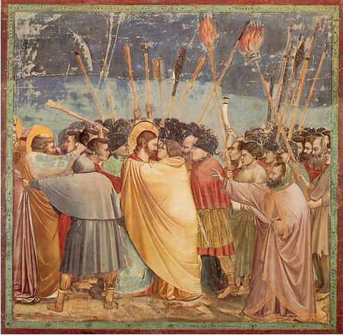
    Giotto di Bondone, Betrayal, c.1305, Fresco, Arena Chapel, Padua, Italy.

    Fine and classical art was particularly prominent at this time, and was found most commonly to visually illustrate a message or meaning. History suggests that artisist depicted their love of God through religious symbolism and imagery, though, in reality, works like these were most likely commissioned.

    This painting depicts the biblical story of 'The Betryal' with Jesus Christ, of course, as the central character. Despite of course knowing that Jesus was born and raised in Palestine, he was often depicted as a middle-class man, with blonde hair and blue eyes- portaying him as a higher class, and of apparent status.


     John Everett Millais, Bubbles, 1886, Pear's Soap advertisement.

    As advertisement and consumerism came more commonplace with branding through the developments towards modernity and industrialisation, fine art made a distinct change into signs of graphic design and advertisement. although not modern by today's standards, the introduction of typography in fine art paintings (in particular) blurred the lines between what was considered classic and modern in the ways of fine art and design.

    Introduction of the term 'Graphic Design'

    1922, William Addison Dwiggins (successful designer):

    'In the matter of layout forget art and the start and use horse-sense. The printing-designer's whole duty is to make a clear presentation of the message- to get the important statements forward and the minor parts placed so that they will not be overlooked. This calls for an exercise of common sense and a faculty for analysis rather than for art.'

    The statement above was believed to have been one of the first quotations regarding the practice of graphic design- still relatively new in the history of art, with modernist route and ideals.

    Herbet Spencer: 'Mechanized art'
    Max Bill and Josef Muller-Brockman: 'Visual Communication'
    Richard Hollis: 'Graphic Design is the business of making or choosing marks and arranging them on a surface to convey an idea.'
    Paul Rand: 'Graphic design, in the end, deals with the spectator, and because it is the goal of the designer to be persuassive, or at least informative, it follows that the designer's problems are twofold: to anticipate the spectator's reactions and to meet his own aesthetic needs.'

    Again, the above quotations were a direct response or view in relation to the graphic design practice. In summary, it was understood that graphics was, and has always, been about the message, in true modernist style- "form follows function."

    'Whatever the information transmitted, it must,ethically and culturally, reflects it's responsibility to society.'- Josef Muller-Brockman

    'Although graphic design as we know it originated in the late nighteenth century as a tool for advertising, any, assosciation today with marketing, advertising, or capitalism deeply undermines the graphic designer's self-image. Graphic design history is an integral part of advertising history, yet in most accountants of graphic design's origins advertising is virtually denied, or hidden behind more benign such as "publicity" and "promotion". This omission not only limits the discourse, but also misrepresents the facts. It is time for graphics design historians, and designers generally, to remove the elitist prejudices that have perpretuated a biased history'.
     -Steven Heller, Eye, No. 17, 1995, reprinted in Beirut, M., Drenttel, W.,Heller, S. and Holland, D.K (eds.), (1997), Looking Closer 2, New York, Allworth Press, pages 112-119.

     This quote, from Steven Heller tells of the period in which graphic designers desperately persued emancipation from links with advertising, despite the fact that they so often go hand-in-hand.

    Edouard Manet (1832-83), 'A Bar at the Folies Bergeres, 1882'.
    Modernist paintings were an influence for graphic design, and this was often reflected in their new aesthetics and techniques- both commonly sharing the link of depicting modern life.

     Designs by Henri de Toulouse-Lautrec c. 1890's

    Graphic design emerges from modernism, adertising events and new leisure activities that the movement bought. A move away from fine art with the addition of typography and a new consideration for composition and layout.

    Alphonse Mucha, 'job' c. 1898, poster for cigarette papers.
    Art Deco and Art Noveau was a big movement around this time, along with decorative design through arts and crafts. Again, fine art plays a big part of design- the line between advertising and fine art is very fine.


    The new avante-garde (yet still very decorative) design styles focused upon composition and layout- the distinction between fine art and graphics becomes steadily greater and more distinguished.
    There certainly is an increase in graphic aesthetics and visual communication through Europe, however, Britain still remains reasonably conservative, not emerging at the same "cutting edge standard" as countries such as Russia and Germany until around 1960-1970.

    Savile Lumley, 'Daddy, What did YOU do in the Great War?' c. 1915, poster.

    This poster was massively influentual in the war effort. Again, this shows the conservative nature of Britain at this time- with a blend of fix art and graphic typography- still quite a classic design in comparison to many other parts of Europe in the midst of modernist states.

    Andrew Leete, Britons [Kitchener] wants you!
    1914, poster (left), James Montgomery Flagg,
    I want you for U.S Army, 1917, poster.

    Graphic design really comes into play in Britain and the U.S during the war effort (as aforementioned), both depict traditional and patriotic messages, as well as very similar in style. This visual communication can easily be interpreted, not just in the particular countries, but globally.


    Germany was increasingly becoming more industrious and this was reflected in the Bauhaus period of graphic design, along with Russia, this was certainly an era and country of design to be reckoned with!

    Wassily Kandinsky (1886-1944), Composition VIII, 1923.

    Fine Art was increasingly being pushed towards methods of abstraction- Wassily Kandisky (a Russian artists living in Germany, who taught in the Bauhaus) was one of the founders of expressionist abstraction at this time.

    Lissitzky, Beat the Whites with the Red Wedge, c.1919, poster.

    This was a defining abstract image of the times in Russia- the geometric poster depicted the Russian Bolsevihks fighting against the white army heirarchical government- this was considered very forward in expressionism, yet it was still easily communicated to the masses, and even the 60% of Russians who were classed as illterate at this time- bold and direct- exactly what graphic design should be.

    F.H. Stingemore (UK), London Underground Map ,1931-1932.

    This was the first time in Britain that graphic design really took off and developed from it's more classical fine art roots, as F.H Stingemore designs the first London underground tube map.

    Henry C. (Harry) Beck (UK), London Underground Map, 1933.

    Harry Beck updates this a year later with a more technical, colour-co-ordinated layout.


    Again, after Harry Beck, the map takes subtle changes, yet they really improve the clarity and visual communication of the design. The underground map is now representative of designs the world over, and globally recognised, with very little change in the past seventy years- a brilliant example of the effect that good graphic design can have.


    Simon Patterson (1967-), The Great Bear, lithograph on paper.

    The "adaption" of the original design of the underground map, developed by Simon Patterson showing a "constellation of stars", each celeberity represented on a different tube line, each with a certain, specific connection, in a witty commentary.
    This is a great example of just how much graphic design is influenced by social change and politics- the underground map, once used as a tool to guide the city workers, and now a mockery of the culture of celebrity, and the obession that it brings in modern day.

    Oskar Schlemmer (German), Bauhaus logo, 1922.

    The Bauhaus art school in Germany, setting the rules for graphic design within Europe, and all over the world.

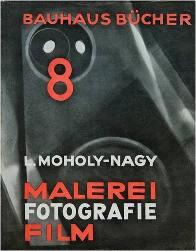
    Laszlo Moholy-Nagy (Russian), Painting Photography Film, 1925, book cover.

    The Bauhaus movement and the graduates of it's school were famed practitioners, including Moholy-Nagy, a key artist and photographer working in the school.

    Herbert Bayer (German), Kandinsky 60th birthday exhibition, 1926, poster.

    This poster design for Kandinksy's 60th birthday exhibition really reflected his own work, and that of the Bauhuas- angular, clean and cutting edge.

    Piet Zwart (Dutch) Het boek van PTT, 1938 (Dutch telephone service book).

    Other countries were certainly taking influence from the development of graphic design that germany and the bauhaus bought. This Dutch telephone service book with collage, angular composition and design has clear industrial influence, but with the country's own character.


    Herbert Matter (Swiss), Swiss Tourist Board, c. 1932-34, posters.

    Swiss graphic design was also really developing and making it's mark at this time- and is still considered to be one of the leaders of the practice of graphic design to this day.

    A.M. Cassandre (French), L'Intransigeant, 1925, newspaper poster.

    Cassandre was one of the key designers of this time, where abstracted imagery represents design.

    A.M Cassandre (French), Etoile du Nord, 1927, poster.

    This poster advertised a railway line from Paris-Brussels-Amsterdam, this was visually representative, yet still very sleek and abstractive- Cassandre was a brilliant example of how informative design can easily be combined with aesthetic beauty.

    Tom Purvis (UK), LNER, 1937, poster.

    Ten years on, British design is still generally quite conservative and focused on the practice of fine art.

    Ludwig Hohlwein (German) Reichs Sports Day for the Association of German Girls, 1934, poster.
    Ludwig Hohlwein (German) Degenerate Art, 1936, exhibition poster.

    In the dictatorship of Germany under Hitler, social realism was replacing the modernism of the Bauhaus in his classic tastes and principles.
    Degenerate Art was an exhibition in which Adolf Hitler selected modernist art to highlight "all that was wrong with modern art", the irony, and the paradox, of course, being that the exhibition poster was in the typical modern style.

     Hans Scheleger (German, working in the UK) Eat Greens For Health, 1942, poster.

    Scheleger was a German designer, working in the UK. His design was understated and low-key, promoting good health in the war, and introducing a modern aesthetic to the still reasonably conservative designs of the country at that time.

    Josep Renau, (Spanish) Industry of War, 1936.

    Graphic design became an "underground" practice at this time- it was a manual but effective practice in method and technique, but, most importantly, it was intended to promote and communicate a message.

    Josep Renau (Spanish), Stalingrad: The New Star of Freedom

    Aesthetic has been replicated through graphics, advertising began to utilise this, and is continued still today.

    Pere Catala i Pic (Spanish), Let's Squash Fascism, 1936.

    This is a great example of graphics when text or typography is not always necessary- sometimes, infact, it can detract from the delivery of the message, as I believe it would do in this image's circumstance.

    Abram Games, catalogue for 'Exhibition of Science', Festival of Britain, 1951.

    Poster created during WWII, celebrating the end of the War, and new social wellbeing. A celebration of what it means to be British, and crammed with patriotic symbolism, however, the design is still relatively conservative. Abram Games was considered one of the most influentual designers in Britain during this time.

    Paul Rand, advert for Jacqueline Cochran, 1946.

    A new commerical outlook for graphic design emerges- and the fine line between itself and advertisement blends. Paul Rand is considered to be one of the key American designers of this time.
    An economic boom and prosperity throughout the country was promoted and reflected in design, and thus begun the "golden age" of advertising.

    Hlemut Krone for Doyle Dane Berbach, Think Small, advert for Volkswagen, 1959.

    Minimalism and negative space becomes a distinct VW aesthetic- instantly recognisable and distinctive, a true example of effective graphics which transcends time and fashions.

    The design effectively continues through the decades.
    If you place a strong image or idea into the public conciousness, gradually they begin to recognise and associate this symbol, thus creating effective branding through graphic design and advertising.


    Saul Bass, poster for The Man with the Golden Arm, 1955.
    Saul Bass, poster for Alfred Hitchcock's Vertigo, 1958.
    Saul Bass, title graphics for Anatomy of a Murder, 1959.

    Another example of branding design- these series of Hitchcock's film posters are iconic, and almost as recognisable as the films themselves.

     Paul Rand, logo for American Broadcasting Company, 1962.
    Paul Rand, poster for IBM, 1970.

    Paul Rand created some bold, creative and effective examples of commercial graphic design, working with creative, yet simple techniques in the complex world of corporate commercialism.


    "We have been bombareded with publications devoted to this belief, applauding the work of those who have flogged their skil and imagination to sell such things as: cat food, stomach powders, detergent, hair restorer, striped toothpaste, aftershave lotion, beforeshave lotion, slimming diets, fattening drinks, deodernats, fizzy water, cigarettes, roll-ons, pull-ons and slip-ons..."- Ken Garland, First Things First Manifesto, 1964.

    Ken Garland was a British designer who had a great view against the opinion that "there's more to life than being part of a consumerist society", and wanted to do something with more social conscious.

    F.H.K. Henrion, Stop Nuclear Suicide poster, 1960.

    Social concious did indeed play a big part in visual communication and graphic design in Britain throughout the 1960's in the height of fears of the threat of nuclear war, whereupon this poster was created as a reaction to stop British disarmented, a logo which we now associate with peace, with the skull image representative of the nuclear bomber.

    Seymour Chwast/Push Pin Studio, End Bad Breath Poster, 1968.

    This image, by Seymour Chwast represents the Vietnam war, Uncle Sam, the symbol of true American patriocism, with 1352 bombers in his mouth, with the war "leaving a bad taste in your mouth", depicting a profound message, perhaps even leaving the viewer questioning mortality and political reasoning of the war.

    Art Workers Coalition, Q. And babies? A. And Babies, 1970.

    Another example of how image and text work in harmony with one another- does it need the text? or does this enhance it?
    The text comes from a transcription of an order from a platoon of soldiers, with a very strong anti- war statement, links between the text and image make this hard to distinguish- is it photography, or is it graphic design?

    Hipgnosis, 10CC, Deceptive Bends sleeve design, 1977.

    Hippy movement transforms the abstract nature of graphic design...an era of music when then transforms into prog rock...

    Jamie Reid, Sex Pistols, Never Mind the Bollocks...sleeve design, 1977.

    A real backlash in general attitude, culture, and design with the introduction of the punk rock era to music- cut and paste aesthetic of design reflective of the fashion of the time- full of "DIY style" with rips and tears.

    Peter Saville, FAC 001, The Factory Club Night Poster.

    The very first poster design for Factory records, created by Peter Savile whilst studying at Manchester Polytechnic (now Manchester Metropolitan), and, in typical student fashion, he produced the poster two days after the event took place! Which, ironically, was perfectly suited to the factory's relaxed ideals!

    Peter Saville, New Order, Blue Monday, sleeve design, 1983.

    The best selling 12" ever made- constructed with a very elaborate folded design- expensive to make, therefore, and the band actually lost 30p per copy sold!
    This design showed a move into postmodernity- was packaging and form more important than the product?


    Neville Brody, The Face magazine covers, 1980's.

    Brody was a key figure in post modernism, revolutionising type-settings and composition.
    

    David Carson, Ray Gun, double page spread.

    In America, the same influence and movement of design is occuring. There were many links with the "grunge" movement of Europe, but also very innovative in "graphic design for graphic design's sake"- post-modernity was perhaps a little over-the-top at this time, with far more consideration in aesthetics than informing.

    David Carson, Don't mistake legibility for communication

    The "rules" of graphic design were really being manipulated and tested around this age of experimentation of form in postmodernity, David Carson asks, are legibility and communication the same thing?

    Public Image Limited, album, sleeve design, 1986
    Public Image Limited, compact disc, cd packaging, 1986.

    John Lydon's band- with the fallout of the sex pistols they reflect upon commercialism, industry and politics and focus on the music as oppossed to "the image", yet still a very bold design- perhaps undermining advertising and branding in a mocking simplicity.

    Peter Blake, Band Aid, Do the know it's Christmas?, 1984.
    Original record collage cover for the charity single.

    Chumbawamba, Pictures of Starving Children Sell Records, 1986.

    Political band- very knowing of what graphic design and advertising can do to publicise, in this mocking, question of "charity".
    Designers Republic, Pop Will Eat Itself, Ich bin ein auslander, sleeve design, 1994.

    Designers Republic are considered a very important design company- breaking away from the traditions of "only finding sucess in London", they moved, but came back to their hometown of Sheffield, and made a huge impact on design in their city.

    Julian House (For Intro), Primal Scream, Xtrmntr, sleeve design, 2000.

    Cut-and-paste graphic design develops around this time- a revival of 1960's/70's "DIY" style.

    Mark Farrow (Farrow Design), Spirtiulaized, LAdies and Gentlemen we are floating in space, CD packaging, 1997.

    Post-modernist in graphic design- the product packaging, once more, became as collectable as the product itself.
    The design reflected social lifestyle and cultural change- the pshycadellic drug-fuelled lifestyle represented by the "tablet" vector design.
    Mark Farrow (Farrow Design), Spiritualized, Ladies and Gentlemen we are floating in space, limited edition CD packaging 1997.

    Each of the tablets were the size of a CD- this collectable product existed in itself- CD or no CD.

    The Coup, Party Music, withdrawn CD cover, 2001.

    Taken before the incidents of 9/11 (the event happened two years after this CD cover was published)- this image has an uncanny, frightening resemblence to the events of the day, and, of course, had to be withdrawn from shelves after 9/11.
    The image was produced to represent the white American higher-class domination being over-ruled and destroyed.

    In 2001, Primal Scream had a lyric in a song "bomb the pentagon" which had to be censored- the band was "damned if they do/damned if they don't"- they could easily have been seen to be "selling themselves out" as well as being considered unsensitive to the event.

    Time magazine cover, September 14th 2001.

    Jonathan Barnbrook, Bastard Typeface, 1990.

    Design took great influence from the past around this time, with Jonathan Barnbrook creating a gothic German inspired typeface named "Bastard"- reflecting upon Nazi propaganda typography used on their imagery and design during the War.

    Jonathan Barnbrook, Olympukes

    A graphic representatioon of imagery. Olympics is a "cash cow"- the imagery can be taken from two different views as to what he is portraying- a serious awarenesss, or personal distaste?


    "Quite understandably, the people behing these campaigns have come to think of themselves as cultural philosophers, spiritual guides, artists, even political leaders. For instance, Benetton, rather than using it's ads to extol the virtues of it's clothing opted to communication what Oliviero Toscani believed to be the fundamental truth about the injustice of capital punishment according to the company's communication policy, Benetton believs that it is important for companies to take a stance in the real world instead of using their advertising budget to perpetuate the myth that they can make consumers happy through the mere purchase of their product"- Naomi Klein, Truth in Advertising, 2000 (in Looking Closer 4, page 64).

    As graphic design became more contreversial and experimental, there were many mixed opinions of the practice- often leading to writings of a subjective, biased nature.


    Oliviero Toscani, Benetton adverts, 1992.
    Toscani goes against traditional advertising methods to create multi-cultural, racial and provocative imagery.
    The images at the time were very contreversial- the bottom depiciting a Catholic family with a dying AIDS sufferer with an uncanny resemblence to Jesus Christ- a liking of which not many approved of.
    "It seems like a nobal goal, yet Benetton's political branding campaigns implicitly promise cutsomers a happiness of another sort- not just beauty, status or style, the traditional claims fashion companies make, but virtue and engagement. And that's where the problems arise, because this claim is simply not true. Benetton's clothing has nothing to do with AIDS or way or the lives of prisoners on death rowm and by using these issues in sweater advertisements, Benetton is inserting a layer of distance and mediation- represented by the Benetton name itself- between consumers and these important issues". - Naomi Klein, Truth in Advertising, 2000 (in Looking Closer 4, page 64).
     
     
    Barabara Kruger, I shop therefore I am, 1987.
    Barbara Kruger/Selfridges, I shop therefore I am, 2006.

    Barbara Kruger is a fine artist with a post-modernist view of consumer culture, what forms our identity today? Buy collaborating with Selfridges twenty years on, is she mocking the consumer, or simply "selling out"?


    Graphic design has transformed in through the decades, yet it's principals are still the same- "solving a problem" through visual communication.