For our seminar on the theories and practices of deconstruction, as well as scouring internet sources for examples used at the start of deconstructivism, as well as odes to the style in modern day, I have been amazed at the variation and creativity of designers.
Below, I have analysed a select few whose ideas and principles have influenced, been influenced, and now, influence myself...

A poster for a lecture held by Graphic Designer, creator of 'Ray Gun' magazine, and leader of the deconstruction movement- David Carson (held in the year 2000).
The poster uses the work from a Ray Gun magazine cover in abstract formatting, as was the deconstructivist style- overlaping imagery, manipulating the kerning between letters- with an interesting blend of texture and font (as well as point size and colour).
However, the deconstructionist style of Carson's work is blended with a modern, standardized formatting in the lower half of the poster- complete with more finite details of the lecture in a "more organised" traditional aesthetic- perhaps slightly contradictory to the deconstructivist style- though many elements have been used and considered in this design.

Weingart's style is a great example of how typography can be manipulated and transform the way in which the viewer reads text, using deconstructive methods and design.
The poster above is injected with so much context and conflicting styles- it leaves the viewer to their own interpretation- how they choose to read the text- where to start, where to finish- all the context is there- though manipulated by imagery, heirarchy of font, point size and the characterists portrayed through the anatomy of the type- which demand your attention upon first viewing- which sections of the text are most attention-grabbing.
Weingart also uses interesting variations of alignment in his poster- flush, left-aligned and right-aligned all working in harmony, thanks to the addition of his collage-esque layout, creating an angular and unique design.
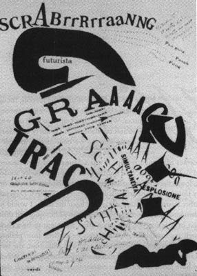
This Furturist, expressionate design, by Marinetti combined his poetry and literature with deconstructivist uses of typography and format to create an expressionate, almost wild dialouge which forces the viewer into a state of contemplation- the abstract composition of loud bursts and energetic movement forcing you to read the poem in a certain way, an unexpected way that was so definative of the deconstructivist style.
I find Marinetti's work absolutely fascinating- the thickness of line, the geometric and direction to his page show more than just a theoretical lyricist and poet, but of a mathematical mind with intense thought processes.

I really liked this "contemporary ode" to the deconstructivist style of David Carson, created by '~TheColorOfTheSky' on deviantART- a far more subtle approach that the work as seen by Carson (particularly throughout 'Ray Gun')- but a refreshing example of how deconstruction in graphic design can work "for the masses" in a more legible and readable layout and format structure.
I paritcularly like the negative leading used through the text at the top left-hand corner in this piece- really making the viewer work for the rich content, therefore, naturally having to generate more of a thought process when reading.
To me, this is a great example that deconstruction is not restricted to a movement, or an era- from the very fact that in deconstruction, the real value is in the thought process, the theory behind the work, which, of course, can be abiding.

I really love this piece by Swiss Graphic Design company, Geigy- blending methods and techniques of post modernist with subtle deconstruction in a far more fresh and contemporary design than most- as the Swiss are so highly reknowned for.
Here, they blend text and colours with no distinct order of viewing in their composition- the only factor which may characterise the title being the larger point size in the centre palette- which we would naturally assume is the hierarchical element within the design.
A really interesting balance (or lack of it!) is used in the design- an abstract structure using the geometric shapes and bright colours against the monochromatic photographs and text against a vast deal of negative space created from the white background to make a bold and memorable design- a characteristic undisputable in regards to deconstruction.
Well somehow I got to read lots of articles on your blog. It’s amazing how interesting it is for me to visit you very often.
ReplyDeletecreate beautiful custom flyers design
create beautiful custom flyers design
create amazing flyers for your next event
make the best business logo design
do stunning business handout design
Great read! I really enjoyed how you explained deconstruction in graphic design—especially how it challenges traditional layouts and expectations. It’s interesting to see how these principles can also be applied in the custom printing
ReplyDeleteworld. For example, using deconstructed typography or asymmetrical compositions in custom packaging or printed materials can create a bold brand identity. It’s a creative way to make printed designs stand out, especially in a saturated market. Thanks for the insights!
Fascinating breakdown of deconstruction in graphic design — these creative disruptions in visual hierarchy reflect the same kind of bold, unconventional thinking that fuels effective digital marketing services today.
ReplyDeleteThis website designing Website Designing perfectly aligns with the brand voice and target audience.
ReplyDeleteVisit graphic design helps businesses stand out from the crowd.
ReplyDeleteGreat post! It's fascinating to see how deconstruction in graphic design challenges traditional norms and encourages creative expression. For businesses in Hyderabad looking to establish a unique brand identity, logo design services in Hyderabad offer innovative solutions that blend creativity with local insights, ensuring your brand stands out in a competitive market.
ReplyDeleteIn today’s fashion market, people look for brands and services that offer personalized and stylish clothing options. One growing trend is the varsity maker which helps customers design their own varsity jackets with unique colors, logos, and custom details. This service is popular among students, teams, and fashion lovers who want a standout look. It allows full creativity while keeping the classic varsity style alive. Many people choose it for events, school wear, and street fashion. A varsity maker makes it easy to create high-quality jackets that match your personality and give a modern, trendy appearance every day.
ReplyDelete