Saturday 19 February 2011

Typography's Role within Communication and De-Construction.


With aid of the text 'Thinking with Type' (Lupton, E, 2008) and personal insight, I aim to analyse and review the role and effect of typography applied in a de-constructivist manner, particularly examining the 1989 Cranbrook Academy design poster, by past lecturer, Katherine McCoy (see image below).


Traditonally, typography was used as a basic communicator of literacy- the dictation of spoken word, the informant, or the educator. Pre-print, each hand-written document would contain indivdual features- mishaps and flaws in the writing process- no one book or document being quite the same. However, since the innovation of Gutermann's printing press, the boundaries and applications of typography within documentation have been transformed- not only standardized in form and aesthetics (without the arduous task of hand-writing each piece, but now, by mecanical methods), but also manipulating the way in which we read and interpret the text.

In Walter Ong's 'Orality and Literacy: The Technologizing of the World' (1981), he states:

"...Print situates words in space more relentlessly than writing ever did. Writing moves words from the sound world to the world of visual space, but print locks words into position in this space".

Within a standard printed body of text, there leaves little room for the reader's interpretation or imagination to explore- a left-aligned block of dense text, whereupon the words and content are the lone communicators- little but the anatomy and kerning of the typography- not determining our contemplative state, but, instead, the way in which we read the text- it's legibility, it's readibility. These methods of structuring type are ones that we now take for granted- simple negative space and use of punctuation determing when and where we rest in the sentance- how sound is translated to the listener, and how messages are understood.

However, despite the clear need for structural typography within text for readibility, it was the popularization of de- construction which transformed the written word- no longer used to simply enhance understanding within communication, but to almost deter the reader from..."reading", instead, absorbing, contemplating and considering the true content, message and voice of the text. 

French critic and anthropolist Roland Barthes theorised this transformation within printed text- how tyography bought about "the death of the author", whereupon the graphic designer, typographer, and viewer respectively created a visual intepretation of the text with the manipulated layout and structure, not only, as aforementioned, changing or persuading our mindset, but even going as far as to change our emotions and inner thought.
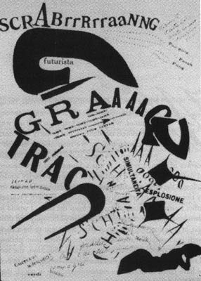
De-Construction introduced the viewer to a whole new concept of reading text- an abstract and bizarre, yet methodically structured form full of imaginative and innovative design. 

In my mind, few designers were more effective in their translations of de-contructivist methods that Katherine McCoy, a past lecturer from the Cranbrook Academy (Michigan, US.)- an art and design school that revolutionised typographic structure- exploring the visual methods of print and form.

The design I have chosen from McCoy's portfolio particularly interested me- like many of her other promotional works this piece is intensely visual- bursting with colour and dense combinations of text and image for a vivid and undisptutedly eye-catching design.

In this piece, McCoy uses a traditional base for her structure- a vertically linear text from top-bottom, but with other elements of textual content "exploded" around it- these key words summarising the text within the geometric framing- distinguishing words with reversed-out type and variations in point size (the school name, 'Cranbrook', for example, being slightly larger in the top left-hand corner). The necessary content is there, but in a far more visually engaging style than the methods of printing documents that came before this renovation of design.


I believe, as all inspiring de-contructionist type would, this design is cleverly constructed- in some places clear and concise, in others, almost illegible- making you almost struggle to read- but that was it's exact purpose. This challenge would make you urge you to persue- to explore further, and, once you had, it would go on to challenge your mind, to consider and contemplate it's form and structure- to truly "read", and not simply to "look".

Thursday 17 February 2011

Examples of Deconstruction in Graphic Design.


For our seminar on the theories and practices of deconstruction, as well as scouring internet sources for examples used at the start of deconstructivism, as well as odes to the style in modern day, I have been amazed at the variation and creativity of designers.
Below, I have analysed a select few whose ideas and principles have influenced, been influenced, and now, influence myself...


A poster for a lecture held by Graphic Designer, creator of 'Ray Gun' magazine, and leader of the deconstruction movement- David Carson (held in the year 2000).

The poster uses the work from a Ray Gun magazine cover in abstract formatting, as was the deconstructivist style- overlaping imagery, manipulating the kerning between letters- with an interesting blend of texture and font (as well as point size and colour).
However, the deconstructionist style of Carson's work is blended with a modern, standardized formatting in the lower half of the poster- complete with more finite details of the lecture in a "more organised" traditional aesthetic- perhaps slightly contradictory to the deconstructivist style- though many elements have been used and considered in this design. 

Weingart's style is a great example of how typography can be manipulated and transform the way in which the viewer reads text, using deconstructive methods and design. 
The poster above is injected with so much context and conflicting styles- it leaves the viewer to their own interpretation- how they choose to read the text- where to start, where to finish- all the context is there- though manipulated by imagery, heirarchy of font, point size and the characterists portrayed through the anatomy of the type- which demand your attention upon first viewing- which sections of the text are most attention-grabbing.

Weingart also uses interesting variations of alignment in his poster- flush, left-aligned and right-aligned all working in harmony, thanks to the addition of his collage-esque layout, creating an angular and unique design.

This Furturist, expressionate design, by Marinetti combined his poetry and literature with deconstructivist uses of typography and format to create an expressionate, almost wild dialouge which forces the viewer into a state of contemplation- the abstract composition of loud bursts and energetic movement forcing you to read the poem in  a certain way, an unexpected way that was so definative of the deconstructivist style. 

I find Marinetti's work absolutely fascinating- the thickness of line, the geometric and direction to his page show more than just a theoretical lyricist and poet, but of a mathematical mind with intense thought processes.

I really liked this "contemporary ode" to the deconstructivist style of David Carson, created by '~TheColorOfTheSky' on deviantART- a far more subtle approach that the work as seen by Carson (particularly throughout 'Ray Gun')- but a refreshing example of how deconstruction in graphic design can work "for the masses" in a more legible and readable layout and format structure.

I paritcularly like the negative leading used through the text at the top left-hand corner in this piece- really making the viewer work for the rich content, therefore, naturally having to generate more of a thought process when reading.
To me, this is a great example that deconstruction is not restricted to a movement, or an era- from the very fact that in deconstruction, the real value is in the thought process, the theory behind the work, which, of course, can be abiding.

I really love this piece by Swiss Graphic Design company, Geigy- blending methods and techniques of post modernist with subtle deconstruction in a far more fresh and contemporary design than most- as the Swiss are so highly reknowned for.

Here, they blend text and colours with no distinct order of viewing in their composition- the only factor which may characterise the title being the larger point size in the centre palette- which we would naturally assume is the hierarchical element within the design.

A really interesting balance (or lack of it!) is used in the design- an abstract structure using the geometric shapes and bright colours against the monochromatic photographs and text against a vast deal of negative space created from the white background to make a bold and memorable design- a characteristic undisputable in regards to deconstruction.

Tuesday 15 February 2011

A Seminar on Deconstruction.


Deconstruction/Deconstructivism/Deconstructionism=

*Deconstruction= approach associated with post-structuralism and Jacques Derrida (author of notoriously obscure and philopshophical writings, 'Of Grammatology', etc...)

*Blended with 20s Russian constructivism in design and architecture- this developed into deconstructivism.

*Visually interpreted in graphic design= sometimes known as 'deconstructivism', however, post modernists largely avoided this term as it categorised people too readily- the complete contrast of the style and message they in fact wanted to portray in their practice.


The pratice of deconstruction became extremely popularised around the world- particularly in the USA where the term "DE-CON" was founded as decontructionism within graphic design.


-Deconstruction, as a practice, was developed from the practices of postmodernism- with the attitude of questioning conventions (particularly those founded in the age of modernism), and the multiplicity of aesthetic styles and approaches to design-


In modern day texts, there are many essayists analysing the manipulations and changes bought upon graphic design through deconstruction- one book in particular, 

'Design, Writing, Research' (1996, Ellen Lupton & Daniel Miller)

evaluate this style, and present it aesthetically throughout the book.

*(ashamedly, this book has been sitting on my shelf for several months crying out to be read- it's now firmly on the to-do list!)*


Perhaps the most famous practioners of deconstruction were students of the Cranbrook Academy of Art, US- students of whom were urged to investigate and explore the warped and manipulated structure of graphic design and layout- creating a style of design which, in terms of the rules and methods traditionally practiced, create a new aesthetic, a type of "anti-design".

-One of the most important factors about deconstruction is the emphasis on the approach, and not the style- the thought process, and not the aesthetic created from this process. Deconstruction focused on the theory, as well as the delivery- creating a complex visionary piece to inspire thought and questioning from the reader (or viewer).
In Jacque Derrain's 'Of Grammatology' (1996, translated 1976) he writes...

(What is Deconstruction?...)

"Approach to texts which analyse their systems of representation- the systems which frame their communication."


Derrain aimed to challenge people's popular, and cultural beliefs. It was widely believed at this time that speech was the main method of communication- whereas writing was considerably inferior. It was believed that speech required no equiptment, no toolds, it was natural, and spontaneously learnt- whereas writing was exterior, it was forced and constructed by cultural learnings, and not our genuine thoughts and emotions.

On the surface, of course, this may have appeared true- but upon analysing these theories it is evident that these opinions are, infact, quite the contrary.

Writing, text, and typography, in deconstruction can be arranged in such a way to provoke thought from the audience, to manipulate their feelings and emotions, to make them question layout and structure- and the very text they are recieving and absorbing- physically having to stop and re-assess the methods and nature of what we have been taught- why should a page read from left to right? Why should a sentance start with a capital letter, and end with a full stop? 
These are all cultural teachings, something developed and cemented in our everyday lives and without these guidelines huge differences to our thought process can be simply achieved.
In a previous reading, 'The Crystal Goblet' by Beatrice Wade (1956) she portrays her opinions that typography should act as "the crystal goblet"- simple, useful- but, in fact, little else. The content of the text was the elaborate golden goblet, the beauty and the elaborate wonder.

But, really, this is far from the truth.

As aforementioned, the layout, structure, higherarchy, point size, anatomy, kerning, tracking- all the seperate, individual and seemingly fractional elements of type can affect, or, in some cases, completely transform how we read a text. Although the author may wish to portray a certain message, this can easily be misconstrued or manipulated by deconstruction.


Anthropologist and theorist Roland Barthes (1968/1971) stated:

"The text itself plays (like a door, like a machine with 'play') and the reader plays twice over, playing the text as one plays a game, looking for a practice which reproduces it..."

reminding us that language and meaning can be taught through structures- reminding and revealing to us the mechanisms of which are put in place when we read.


In Cranbrook Academy's 'Visible Language' journal special edition 'French currents of the letter' (1978) (a journal produced from the works of post-structural theorists) took a standardised accepted form of the academic journal, and using de-constructivist technqiues created a huge awareness of the structure and layout from the viewer's perspective- emphasing kerning increasingly through the pages- footnotes aligned to the right or centre of the page- therefore, no longer being "foot"notes at all. It was simple alterations like these which shook the understanding of layout and structure in design today.

Again, this has been evident in many forms of design since- not only in the traditional sense of layout and structure through the printed mediums and graphic design- but also incredibly effectively in architectural design- the deconstructivist style (as previously mentioned) being influenced by Russian constructivism of the modernist era, but with new and refined philosophies.

Deconstructionist examples in archiecture include...

The Jewish Museum, Berlin 1989-96.
Designed by Daniel Liebsking (previously lectured at Cranbrook College, US)

-A museum with no linear structure- plot or centre- an abstract and visionary experience to house thought-provoking and historical facts and features.


La Parc de la Villette Paris 1982-92.
Designed by Bernard Tschumi- 

A complex and unique design situated in Paris, this park contradicts the practices and principles that park landscpaing has traditionally stood for- being guided through the most scenic and "pleasant" path through- whereas the Parc de la Villette design, built of three contrasting surfaces creates an almost labyrinth-esque effect on the pedestrian or visitor- with three different ways and choices to lead- creating an emancipating and anti-authoritarian atmosphere and feeling that was so distinct in deconstruction.


In Summary...

-Derrida re-examines the relationship between speech and writing- also urging a critical approach to all means of representation.
-Taken up in archiecture (as oppossed to an 'ism').
-Invoked in Graphics at Cranbrook.
-Recognised in works of others (e.g. David Carson).
-Overlaps with stylistic traits of postmodern graphics.
-A provocation of self-reflexivity and critique of limitation.


-De construction questions and critques assumed conventions.

Sunday 6 February 2011

Analysing Avant-Gardism in Graphic Design.


Upon researching avant-gardism within the practice of Graphic Design, I found many thought-provoking and powerful examples- most commonly found in advertising, a medium which is showcased globally in both screen and print formats- seen by millions each day. Of course, the originial purpose of avant-gardism was to provoke social or political change, so advertisements, with their wide-spread accesibility seem the perfect format for modern day.

From searching for examples of avant-gardism within Advertising (to which Graphic Design is, of course, applied) I found many examples- though few with truly original, innovative ideas as avant-gardism aspires to- with few examples appearing truly original (with the exception of the advertising from brands such as 'The United Colours of Benetton' with their range of adverts from Olivier Tuscani), though many draw inspiration from previous advertising campaigns to mock or play upon their original ideals to illustrate a "reality" of the brand- away from the ideaologies of the higher-classes or the elite that the brands are advertising their products to. 

I found two examples which particularly interested me- the 'Absolut Impotence' advertisement for Absolut Vodka and the 'Obsession for Women' advert for Calvin Klein- both portraying a "reality" far-detached from the original, glamorous and sophisticated aesthetic for the brands and products.

The Absolut Vodka advertisement showcases the potential reality of the consumption of their product- far from the sexy, glamorous, and youthful image the product portrays- instead, quite the opposite- an unsexy and potentially humiliating reality with the text 

"drink "provokes the desire but takes away the performance" 

written beneath it- not a great advertisement for young men to aspire to- thus, deterring people from the product.


Again, I found the mock-advertisement for Calvin Klein's 'Obsession for Women' to demonstrate a very similar message- one of the reality of the product, highlighting body dysmorphia- the glamourous men and women shown to us in magazines, and in these Calvin Klein advertisements only driving our self confidence to an even lower level- with ridiculous aspirations to look like these airbrushed models- with a warped mindset that this is how we should look.

Both instances, I believe are examples of avant-gardism within graphic design, or, at very least, the closest we can come to achieving avant-gardism. 

Graphic Design, along with most practices within art and design, are built upon the practice of learning from others, developing your skills from what has been taught before us- both of the examples I have analysed take a parodied look at the high glamour aesthetic produce from advertising- an image that has already been created, but in these cases, manipulated to a state of reality.

Whilst the imagery may not be new, the message broadcast can still be challenging, and provoke social change- one of the key elements of the avant-garde.

Saturday 5 February 2011

Seminar: Defining the 'Avant-Garde'.


-Avant-Garde aims to shock, challeneg and re-assess conventions, often with social and political motivations.-
Objectives:
- Understand the term 'avant-garde'.
-Question the way art/design education relies upont the concept of avant-garde. 
-Understand the related concept of 'art for art's sake'.
-Question the notion of 'genius'.
-Consider the political persepectives relating to avant-gardism.
-Question the validity of the concept 'avant-garde' today.

-Can we be avant-garde graphic designers?


Dictionaires link term- 'avant-garde' with terms like:

innovation in the arts or pioneers...

-idea of doing art/design work that is progressive- innovative.

-but also, it refers to the idea of there being a group of people being innovative.

1. being avant-garde in the work you do- challenging, innovating etc.
2. being a part of a group-being a member of the avant-garde.

*deeply aligned to modernist practices and characteristics*


-nowadays, the term has reached a level of meaninglessness, neutralised to a state where it can be applied to anything- florists, estate agents, wedding dresses...-


Marcel Duchamp is a fantastic example of the birth of the avant-garde practice- his 1917 'Fountain' urinal, and his re-imaging of the Mona Lisa (complete with moustache) mocked the elitism of art, making people question "what is art?". 
His work, along with the other artists in the birth of avant-garde was anti-conventional, anti-elitist, and non-conformist- new, innovative, and re-defining the rules of art. 

 The Fauvist's (or 'Wild Beasts, when translated) were true avant-garde artists, self-taught with new, creative methods and techniques- expressive with colour and brush strokes- which re-defined the ideas of techniques in art, when people were used to classical renaissance portraits the style of the Fauves was deemed as outrageous and "wild" (hence their less than complimentary namesake).


In the seminar, we discussed perceptions and elitism within art and design- reflecting on a subject close to home- the removal of the word 'design' from the 'Leeds College of Art and Design' institute title last year to simply be named 'Leeds College of Art'. As Graphic-Designers-in-training, of course, it may have seemed a bias discussion, yet elitism in the institute seemed clear- with two schools in the building 'The School of Fine Art, etc', and 'The School of Media and Communications, etc' there are just as many design courses as art- yet, as history shows, there is a social favouring within fine art- a snobbery for this historically established practice, yet, what relevance does it hold? Why is it valued above design?


We reviewed the history of fine art...

-In the 16th and 17th century, pupils would copy their masters- almost an "apprentice training" in art to emuliate their style, as oppossed to nourishing their own practice.

-Art has never appeared to be about individuality, even in art and design education today we are taught to develop the styles of others, and to learn from artists and designers before us.

 Tutor Richard showed us a wonderful painting 'The death of Chatterton' by Henry Wallis. 

The picture shows a "beautiful poet genius" as he starves, distressed as he fails another attempt to write his eternal poem. In a fit of rage and the feeling that "the world won't understand him" (clearly a teenager), he poisons himself. 

Wallis' work was a reflection of society at the time- the elitism of the arts, that if everyday society understands their work, then they're clearly doing it wrong.

-Art only exsists on sales- fine art is, in reality, just as commercial as graphic design, as the practice was originally only intended to meet the needs of heirarchy, such as the monarchy for high financial gain.-

 
Art for Art's Sake
Whistler's 'Nocture in Black and Gold: The Falling Rocket (1875).


Autonomous art is independent and "above the world"- aesthetically pure, this approach dominating much of the 20th century.

Whereas avant-garde is political, aiming to make a change, the autonomous artists viewed the "orignial" avant-garde styles as propaganda.


End of the 19th/Early 20th century

Two approaches to avant-garde art:

1. Art that is socially committed (artists being the 'avant-garde' of society, pushing forward political objectives).
2. Art that seeks only to expand/progress what art is (in itself and for itself)/art for art's sake.


-Significant Form-

The relations and combinations of lines and colours, which when organised give the power to move someone aesthetically (which all 'great' works of art posess)- critics tell us why this work is important, with an institutional importance within fine art- we are not "allowed" to establish an opinion of our own.

critics, such as Clive Bell told us that if you didn't recognise the classic styles of artists such as (his personal favourite) Cezanne, then you are wrong.


The 'Art for Art's Sake' approach dominated much of the thinking and practice of art in the 20th century. Behind it, there was no political meaning or reasoning, it was purely abstract and aesthetic.


Jackson Pollock's 'Lavender Mist' (1950) was art critic, Clement Greenberg's personal "pinacle" of fine art, whereupon he "felt the emotion of the painting"- displaying the high level of elitism in Western culture, as oppossed to the Eastern perceptions of art, under Stalin's Communist rule, where the only art allowed to be produced were images of political propaganda.


A problem for the avant-garde is that it seems to necessitate elitism.

So for those members of 'left wing' (interested in social change) there was a tendancy to have to rely upon academic techniques in order to appeal to 'the public'.


Graphic Design, in comparison, will always be invisible (how, in practice it should be- great design should never be noticed), or 'art for art's sake' designers.

Avant-garde graphic design has no respect or consideration for communication, but purely about being experimental- potentially running the risk of not being understood (loosing it's understandibility).


Kitsch: The "oddball cousin" of avant-garde doesn't adhere to usual conventions of design.
Kitsch is a poor imitation of something else- giving the "standard" that people should adhere to.


What is kitsch?

-The idea of inferior, lower-quality, bad taste, "tacky".
-Something that aims to be taken seriously, but fails to do so.
-Failing to meet tastes of a culture that is superior, or above it- anything can be labelled as kitsch- it is defined by the levels of "snobbery".


Kitsch takes cultural standards, not personal taste into account. 
The Elitists believe that art belongs in galleries, not in homes, as kitsch provides them with.

Anything that crosses media can be named as kitsch. Something it's not supposed to be- but who states what is in important, or what has hierarchy is art?


Anything sentimental can be viwed as kitsch. When people are becoming "moved" by inanimate objects...such as royal wedding mug and plate memrobillia...

However, kitsch can cross the line into fine art with name association...


Jeff Koons' life-size scultpure, 'Michael Jackson & Bubbles the Monkey' (1988) would, without the name association, truly be the epitome of kitsch. However, the insitituions once again tell us what is kitsch- and this, as aforementioned, because of Koons' name, escapes that category.

This can be seen with many artist's work today- somehow escaping this term to blurr the lines between taste and distasteful.

As fine art, progressively, becomes more elitist, design becomes more popular- seen by all in printed and web-based media, it is democratic, and by no means elitist, many styles of graphic design now influenced by messages of propaganda, with hints of the avant-garde- yet, as we have learnt, as graphic designers, can we ever truly be original?


AWKWARD QUESTIONS TO ASK YOUR TUTORS...
(this must be done!)

1. Why does our work have to be 'original'?
2. Is it possible to be 'avant-garde' and/or original?
3. If I make my work socially comitted so that people can understand it, can it still be avant-garde innovative?